

IDX Data Dashboard Overview

Now, you are ready to begin using the Vectech Data Dashboard. When you log into the Data Dashboard, you should see the the following screen:

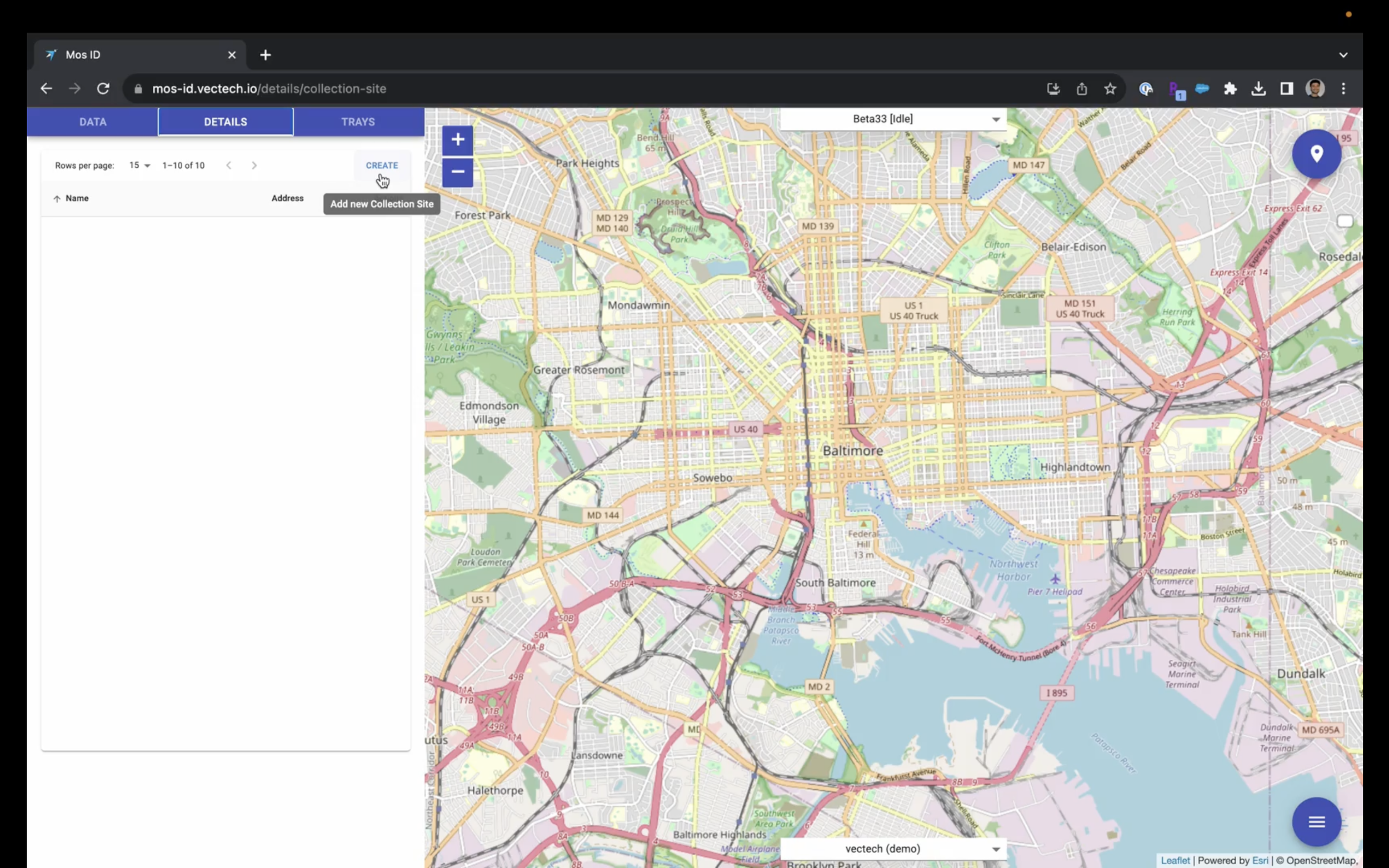
On the right hand side of the screen, you will see a map of your region. On the left hand side, you will see a toolbar with three tabs: Data tab, Details tab, and Trays tab.
On a high level, the Data tab is what we use to filter through data we collected and download that data in different formats. The Details tab is what we use to record where our collection sites are. And the Trays tab is what we use to capture images of specimens and review the algorithm results.
To begin, I recommend that everyone create their collection sites in the Details tab. This will allow us to associate the collection site with the specimens that are collected in the trays.

To do this, select the blue Create icon, and you'll be prompted to enter a collection site name.
Here, just as an example, I'll enter the Vectech office, and there are few ways that you can associate the collection site with the actual coordinates for where that collection site is located. One is that you can enter an address to the GPS location coordinates or you can click this blue map icon and you can actually drop a pin on the map to associate the collection site with that location. So, just as an example, here I'm going to go ahead and put in our address and click ‘Save’ and you'll see a pin where our office location is.

Alternatively, if I wanted to record that this collection site was somewhere at this nearby park, I could zoom in on the park at a location that maybe I don't necessarily have a location where I don't necessarily have an address for and I can click on the ‘Pin Placement’ option and I can zoom in and on the right hand side of the screen, I see an option where I can switch the satellite view in case that's more beneficial.

So, if I had a collection site that was near this baseball diamond, I could go ahead and drop my pin there and click ‘Save’.

So, go ahead and repeat this process for all of your collection sites and that will just make it a little bit easier and faster when you're going through your tray images to associate each of those specimens that you're imaging with the right collection site.
So, once your collection sites have been loaded, you are ready to begin taking images of specimens. Make sure that your imaging tray is loaded with specimens and go ahead and place that imaging tray at the base of your device and slide it in. You will feel a little bit of resistance and then the tray should click into place and you will hear an audible click.
Once you’ve done that, you can go ahead and click ‘Capture New Tray’.

You should see the lights at the base of your device turn on. If not, double check that your device is connected. It should say that it is capturing. If not, if it says Off, then, make sure that you reboot your device.

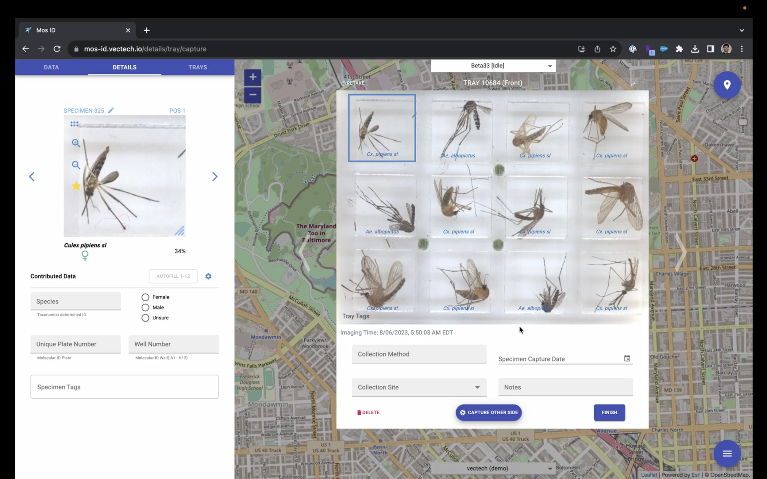
So, now we've got our first image of the first orientation.
If you wanted to get an image of the other orientation, since our tray is double-sided, which I recommend, then just go ahead and pull your device out and flip it over onto the opposite side. So, same specimens, just upside down. Slide that tray back in and click, ‘Capture Other Side’. In a few moments, we will see that the other side of the tray image appears.

And in the blue italicized font, you'll see the identifications that are produced by the algorithm.

If you hover over and select a specific specimen, on the left-hand side, you'll be able to see an enlarged image of that specimen.

You can also drag and drop outwards that image so that you can view it a little bit larger and you can use your scroll bar to zoom in and toggle over the image, or you can use the zoom in and zoom out icons on the left corners of these images.

Underneath the larger image, you will see the species and identification in italicized text, as well as the sex identification from the algorithm.

On the little bit more to the right, you'll see the confidence metric for how confident the algorithm is in these identifications.

Underneath the tray image, we will want to associate the specimens with different variables. So, these types of variables are the Collection Method (what kind of trap type the specimens came from). In this case the specimens came from a CDC Gravid Trap, so we will go ahead and note that.

You can also associate specific specimen capture date with the specimens. In this case, the specimens were collected a few days ago, so I will go ahead and select a date from last week.

And then, you can select the Collection Site and you will see a drop down with all of the collection sites that we loaded earlier in the Details tab. Since I only entered the Vectech office site, that’s the only option I have, but if you entered all of your collections sites, you will be able to choose the appropriate one.

And then if you have any notes that you want to associate with the specimens, something like, if these specimens were collected during a rain storm, you could note that here. Or, if you have any research variables or things that you want to note here, you can do that as well.
If you want to view the opposite orientation of the specimens, on the upper right hand corner of the tray are two to arrows in opposite directions so you can actually toggle between both views of an individual specimen . When you're done you can click ‘Finish’.

In another video, I'll cover the Contributed Data section. This is what we use if you want to contribute data on a new species or if you notice any error in the species identification from the algorithm, you can make these changes here in the Contributed Data section. That will be covered in another video.
Click the ‘Finish’ button and then we can go into the Data tab. The Data tab is how we will filter through all of the tray data that we've collected. Over a long period of time, you'll have a lot of data over many days, over multiple trap sites, and so it will be important to use this if you want just a particular week’s worth of data. Then you can toggle for a particular week’s worth of imaging date or a specimen capture date if that is more appropriate. You can also filter if your organization has multiple devices, you can choose between which devices are the ones that you want to use. If you contributed data, you'll be able to select which species you want to view and you might be able to see that across multiple collection sites to identify where that contributed species is most common or you can do the same with algorithm produced species identification.

On the Contributed Data side, there is also a plates filter. I'll go through that in a separate video, but essentially, if you want to associate your specimens with a particular well plate for downstream pathogen testing or molecular barcoding, you can do that here. Again, more contributed filters for the sex filter. The Collection Sites, if there's only a particular site worth of data that you want, for example, to take a look at how abundance has changed over time at a particular site. Collection Methods, if you only want to see specimens that were collected using a certain kind of trap or certain colony mosquitoes or select from different users that have collected data and again this is a more advanced option that I will cover in a separate video but you can also filter through different kinds of specimens and tray tabs that are custom. I recommend that you exclude empty cells, unknown, and algorithm unsure data for now.

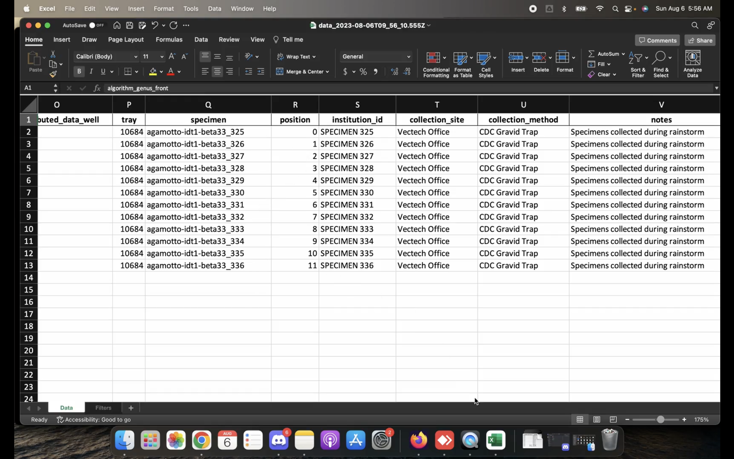
You can download data into formats: one is the Raw Data format.

So, since I’m only capturing one tray, I don’t necessarily need to filter a particular window of time. But you'll get a warning message in that case just because it can grow to be a lot of data over several weeks. I will go ahead and click ‘Continue’ and this is what our raw data format looks like.

You will be able to see what the algorithm has identified on the front side, what the algorithm has identified on the backside (both the species and the sex), variables like when the specimen was imaged, what we recorded for the specimen capture date, if we contributed any kind of data will see that here, will see some variables that are assigned by our software like unique tray numbers and specimen identifiers, what position in the tray that specimen was, where the location is or collection site location is, the collection methods for the specimens, any notes that were associated with that particular tray, the device number, and user. So, there are a lot of variables here and for the most part, it's research institutions that are working with this kind of format of data.
And a more practical view of the data, is to download the Abundance and Diversity Report. And that will just show us the abundance of different species that were collected across our collection sites.

Here, I only imaged one tray that had albopictus and culex specimens, but you'll be able to see on your Y access the full list of any species that you've collected and then across your X access, all of the collection sites. And so, you will have a matrix of that data.

If we go back into the data portal, one last feature is being able to visually view the species breakdown.


So here, we have a pie chart. The inner side of the pie chart is your genus data. Here we have about 3/4 of the specimens are culex and 1/4 were aedes. We can also toggle to see what species those were and if you hover over the external part of the pie chart ring, it will show you about nine of those specimens were culex pipiens and three of those were aedes albopictus.

This concludes the overview of how to use the IDX data dashboard.